Logos
Usually, I begin blogs with a long rambling, but today I’m giving a much shorter one. Simply put, I like semi-pro soccer. A lot. I’m not sure why. With that in mind, some of the branding of semi-pro soccer teams are atrocious. Yes, there are some Detroit City FC’s and Chattanooga FC’s. There are even some New Orleans Jesters’s that are more than passable, but as a whole there are a lot of awful ones. In the last few years, I’ve gotten into badge design – which I get is not exactly full rebrands of teams, but I’ve decided I will post a few here anyway.
TEAM: Baton Rouge United FC
The badge is based around the badge of the Honduran National Team, because most of the players are Honduran in root. The “castle” is the Old State Capital in Baton Rouge. The cross shape, which is off center right now, is due to Baton Rouge’s Catholic roots.

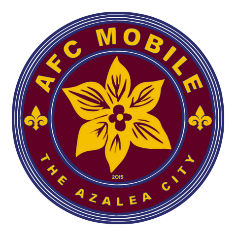
TEAM: AFC Mobile
Simple. Mobile is the Azalea City. Giant azalea in the middle, rounded badge, six stripes to represent the six flags of the city. Fleur de lis because of the French influence in Mobile, which incidentally is the original home of Mardi Gras.
TEAM: Boca Knights FC (Bossier-Caddo Fútbol Club)
The team did not go with this badge, but the original idea of the rebrand was to seem more professional. Colors are taken from the city flag AND the Parish’s flag. Knight’s shield has a fleur de lis because of Louisiana.


